WHY DID PACKAGE REDESIGN
LEAD TO A DECLINE IN BRAND MARKET SHARE...?
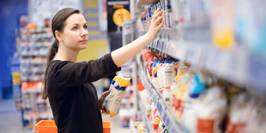
Visual brand properties are the main link between the consumer and your brand - 90% of all transmitted information to the brain is visual. Brands exist in our minds mainly as visual snapshots. The 3 Visual Brand Properties highlighted to the right, are what connects brands to consumers.
“It is far easier to damage a brand than to grow it when comes to packaging design. In fact it’s about twice as likely, as approximately 20% of new packaging systems drove declines in purchases from the shelf – as opposed to the 10% that drove sale increases”. *
A brand’s value or equity is dependent on people’s perception of it. Building these perceptions can take many years, as a brand’s reputation is built by repeated proof that it deserves the consumer’s trust. The visual properties that consumers associate with the brand are an integral part of brand equity.
* Perception Research Services, Winning at the two moments of Truth, Quirk’s Marketing Research Review, Jan 2010
VISUAL BRAND PROPERTIES
IDENTIFIERSVisual elements that identify your brand without the help of any other element. |  |
CONTRIBUTORSVisual elements that contribute to the identification of the brand but do not succeed in doing so entirely on their own. |  |
PASSENGERSUse of category conventions to help with findability |  |
VISUAL BRANDING
IS THE MAIN LINK BETWEEN CONSUMERS & THE BRAND
REDESIGNS & VISUAL BRANDING – GOOD, BAD & UGLY CASE STUDIES
GOOD
Successful branding transition, growing sales by over 10%
Electrasol research uncovered a strong association with stem glass and blue. However, these elements were not deemed to be strong enough to be brand identifiers. Instead they were important visual brand contributors to be used through brand transition.
BAD
Coke seasonal confusion because of inconsistent use of color.
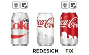
When Coke introduced its 2011 Christmas pack they didn’t take into account the visual properties of their two iconic brands: the red can stands for regular Coke, the white can stands for Diet Coke.
UGLY
Tropicana sales dropped by 20% when this pack redesign hit the shelf.
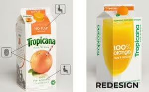
New design failed on many fronts. The most egregious fail was the complete elimination of the Identifiers – the word-mark and the orange with the straw. The chords of familiarity were completely severed.
2275 Lakeshore Blvd W,
Toronto,
ON
M8V 3Y3 -
Canada |
416 503 0676 | v-shopper.com
Copyright © 2026 · V-Shopper